
In my quest for evidence-based design of transit maps, I have been conducting user research for almost two decades. This ranges from supervision of student projects to contract research, and has resulted in a number of peer-reviewed publications. For my PhD in cognitive psychology (awarded by the University of Nottingham) I investigated individual differences in reasoning strategies. Since then, I have researched into how people interpret information and make inferences from it, and why they make mistakes – an excellent starting point for understanding how people interact with a piece of complex information design such as a transit map.
I primarily focus quantitative research: my training and experience as a cognitive psychologist has provided me with a wealth of knowledge on how to devise research to understand behaviour and
evaluate design effectiveness via experiments and numerical measures. Many aspects of map design
have been investigated, with planning times, planning errors and journey choices used to evaluate effectiveness, alongside quantitative measurements of user-opinions of designs.
As well as performing my own research, I have been instrumental in setting up and organising the Schematic Mapping Workshop series, taking place at the University of Essex (2014), TU Wien (2019)
and Ruhr-Universität Bochum (2022). This aims to bring together researchers, designers and transport professionals to discuss all aspects of schematic mapping, past, present and future.
My major findings are summarised below along with links to publications – titles only are given here for clarity – a full listing of research publications is in the writing section of these web pages (opens in a new window/tab). My full academic CV can be downloaded here
An essential part of determining usability is to measure performance. A design that is easiest to use
is the one in which efficient journeys can planned in the shortest possible time with the fewest errors. Meaningful data can be collected with a pencil and paper and stopwatch but computers are also invaluable, for example using touch-screens to input responses. By asking people to use more than one map (within-subjects designs) it is possible to identify the best-performing map for each person on an individual basis. Examples of measures that I have used in my own research include:
-
Line tracking. Is a direct journey between highlighted stations possible without changing trains?
This has a simple yes/no answer, hence response times and/or error rates can be analysed. -
Journey planning time. Time taken to plan a journey between two highlighted stations. This works best for complicated journeys where multiple interchanges between lines are necessary.
-
Journey choice. This can be identified, for example, either by drawing the planned journey on a map or by asking for interchange stations to be identified.
-
Estimated journey duration. A measure of whether an efficient (i.e. non-roundabout) journey has been planned. This is determined, for example, either by official journey planning software, or estimated (for example, two minutes per station passed and ten minutes per interchange).
-
Network learning. A useful by-product of using a map is that the basic structure of the network can
be learned in the process. We are currently investigating methods of measuring learning, such as the number of correct, versus incorrect, features of a map that can be identified after using it. -
 Route discrimination. We are currently testing a hypothesis that users prefer maps in which they can easily identify the best route from multiple options. The measure of performance is the time taken to identify the preferred journey when pairs of options (Route A versus Route B) are presented.
If a map is rejected by users then it has failed, no matter how easy it is to use (as determined by objective measures). Identifying evaluations of designs by users has been built into my research since the very beginning. This has supplied numerous insights into aspects of design that are important for people – genuine user-centred design.
-
Questionnaire evaluations (quantitative). We have developed and validated a questionnaire comprising statements about qualities of maps which people rate using a Likert scale. Responses can be aggregated to give an overall score for each map for each individual. An example of a questionnaire can be downloaded here.
-
Questionnaire evaluations (qualitative). Simply asking people what they particularly like and dislike about individual maps has driven research forward, with interesting new hypotheses about usability.
-
Direct user ratings. Asking people to rate sets of maps for usability (easy to use/neutral/hard to use) and attractiveness (attractive/neutral/unattractive) has yielded interesting findings concerning sources of people’s beliefs about usability and how these are modified with experience.
-
User preferences. Users can simply be asked which design they would rather take away and use from one or more choices, or else can rank order preference from a number of options.
The effects of design rules on usability
-
 Designing schematic maps using using standard London design rules (known as octolinear designs) need not result in the most usable versions. Most notably, a curvilinear map of the Paris Metro has repeatedly been shown to be easier to use (as measured by journey planning time) than the official octolinear version.
-
 Maps based on concentric circles and spokes are extremely popular on the internet but, comparing
a Berlin version with a conventional design, the concentric circles map was slower for journey planning and received lower usability ratings and was less popular than the more conventional design.
 The effects of line configuration on journey choice
-
In our evaluation of Docklands Light Railway prototype maps, people appeared to have a preference for (a) lines with a trajectory pointing
roughly towards the journey objective; and (b) postponing interchanges
as late as possible. Combining the two, maps with certain configurations resulted in the frequent planning of inefficient (roundabout) journeys.
The effects of route colour-coding on line tracking
-
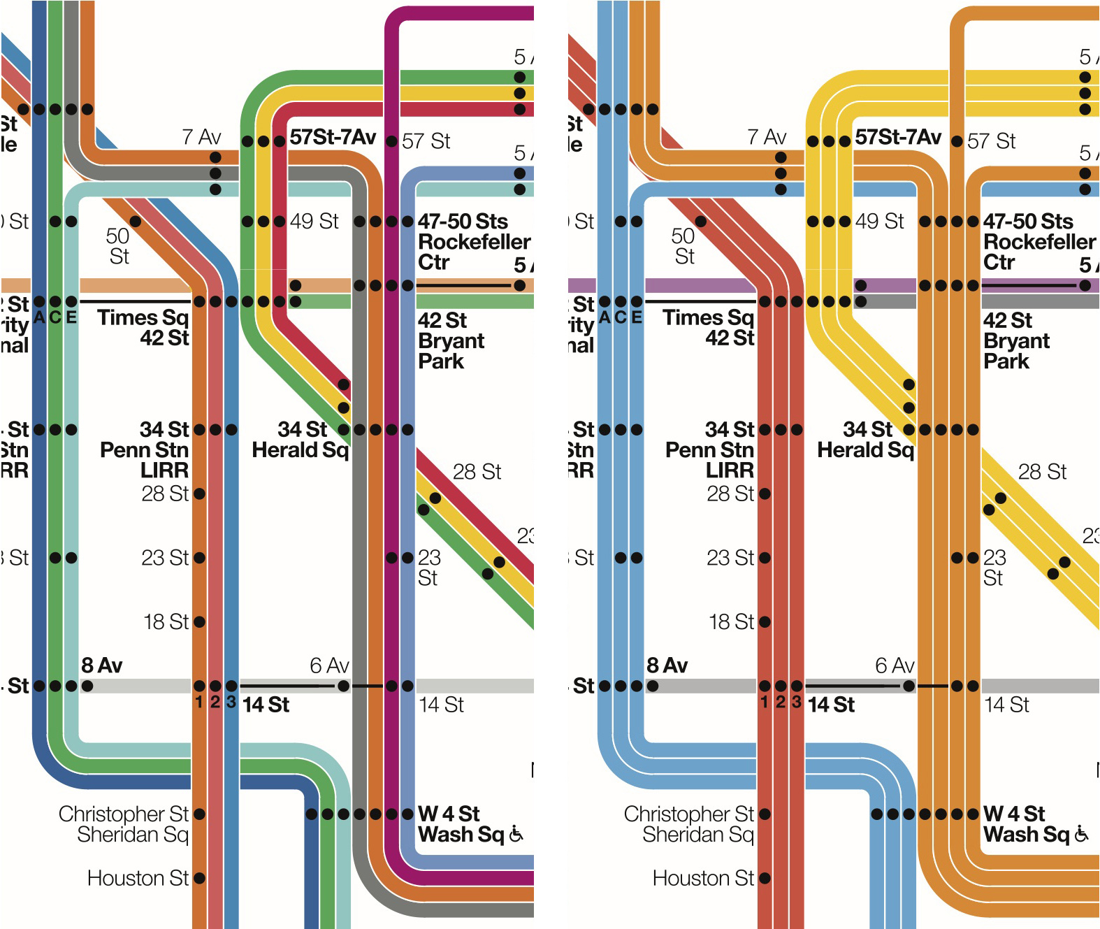
We investigated three different methods for colour-coding the New York City Subway map using a route-tracking task (Is there a direct route from A to B, Yes or No?). Giving separate colours for each individual route resulted in the fewest errors but only for certain
types of navigational hazard: where lines branched or crossed over each other.
Individual differences in people’s subjective evaluations of map usability and aesthetics
-
 If a person rates a map as being hard to use or easy to use, this must imply some sort of underlying (perhaps implicit) theory of effective design. We found that it was possible to identify separate groups of people who either believed that London-style design rules (octolinearity) yielded the most effective designs or else that simple line trajectories yielded them. Surprisingly, the judgments of people who were likely to possess relevant design expertise were barely distinguishable from people who were categorised as non-expert.
Issues in usability testing of schematic maps
-
It is straightforward to compare prototypes to see which version is the most effective, but
identifying universal, easy-to-communicate design principles is much harder. The difficulty
comes from preparing fully matched controls which only vary along the dimension of interest –
for example, comparing maps with different design rules.
-
A persistent finding in all my research (and many other usability domains) is the usability gap – a
zero correlation between usability as determined by objective measures versus usability as rated subjectively by the people taking part in studies: people choose maps that they find harder to use
and reject maps that they find easier to use. Psychologists can easily dismiss subjective ratings on
the basis that these reflect mere errors and prejudices but a less adversarial approach would be to understand the mismatch and develop objective measures of performance with psychological utility.
Automated schematic map design
-
A paper that outlines a method for computer-generated curvilinear maps by taking a conventional London rules (octolinear) design and converting straight lines and corners into Bézier curves.
Experimental research into schematic map usability
-
Review papers that (a) give an overview of state of the art in schematic map research (2020);
(b) discuss why research into intelligence and inference is relevant to schematic map design (2017); and (c) outline empirical research into schematic map usability (2014).
History of schematic maps
-
The 2018 paper discusses the wave of schematised maps that were created in the 1930s (Henry Beck’s 1933 London design was one of many across the world). The 2017 paper discusses the potential benefits and pitfalls of digitally recreating historic schematic maps.