
In 2011, I was invited by Doug Rose, of FWT Studios – on behalf of the Docklands Light Railway – to evaluate the usability of several train and station network diagrams. Conducting testing at the University of Essex, I devised and implemented a computer-presented quantitative research program to evaluate
the designs. Our recommended solutions were displayed on trains and stations throughout the network.

I was asked to evaluate four car line diagrams (including the then current version) and two station diagrams. Among the few specific requirements was a request to evaluate whether people could easily identify station fare zones. Mainly, I was given complete freedom to evaluate the usability of the designs.
These were relatively simple maps and I decided (1) that usability could be determined from straightforward tasks with quantitative measures of performance and (2) that computer presented tasks with touch-screen response collection should be used to make the tasks as natural as possible, and facilitate accurate timing. As
well as objective measures of effectiveness, I also included map preference tasks and rating tasks to gather subjective user opinions of the designs. In total, 322 people were tested.
Five tasks were devised. Each comprised a sequence of individual trials. Measures of performance
were response times and error rates for each prototype. In addition, for certain tasks, it was (crucially) possible to evaluate whether the most efficient journey had been planned. Each person experienced
just one map – in other words, a between-subjects design was used.
-
Station touching task. For each trial, a station on the map was highlighted. The task was to touch the station as rapidly as possible. The purpose of this task was primarily to familiarise people with the map and the equipment.
-
Station finding task. For each trial, a station name was displayed at the top of the screen. The task was to touch the station on the map as rapidly as possible.
-
 Journey planning tasks. There were two versions. For each trial people were asked either to touch a button to indicate that a direct journey was possible or else touch the suggested interchange station.
-
From highlighted station to the terminus station named at the top of the screen.
-
Between pairs of stations named at the top of
the screen (above right).
-
-
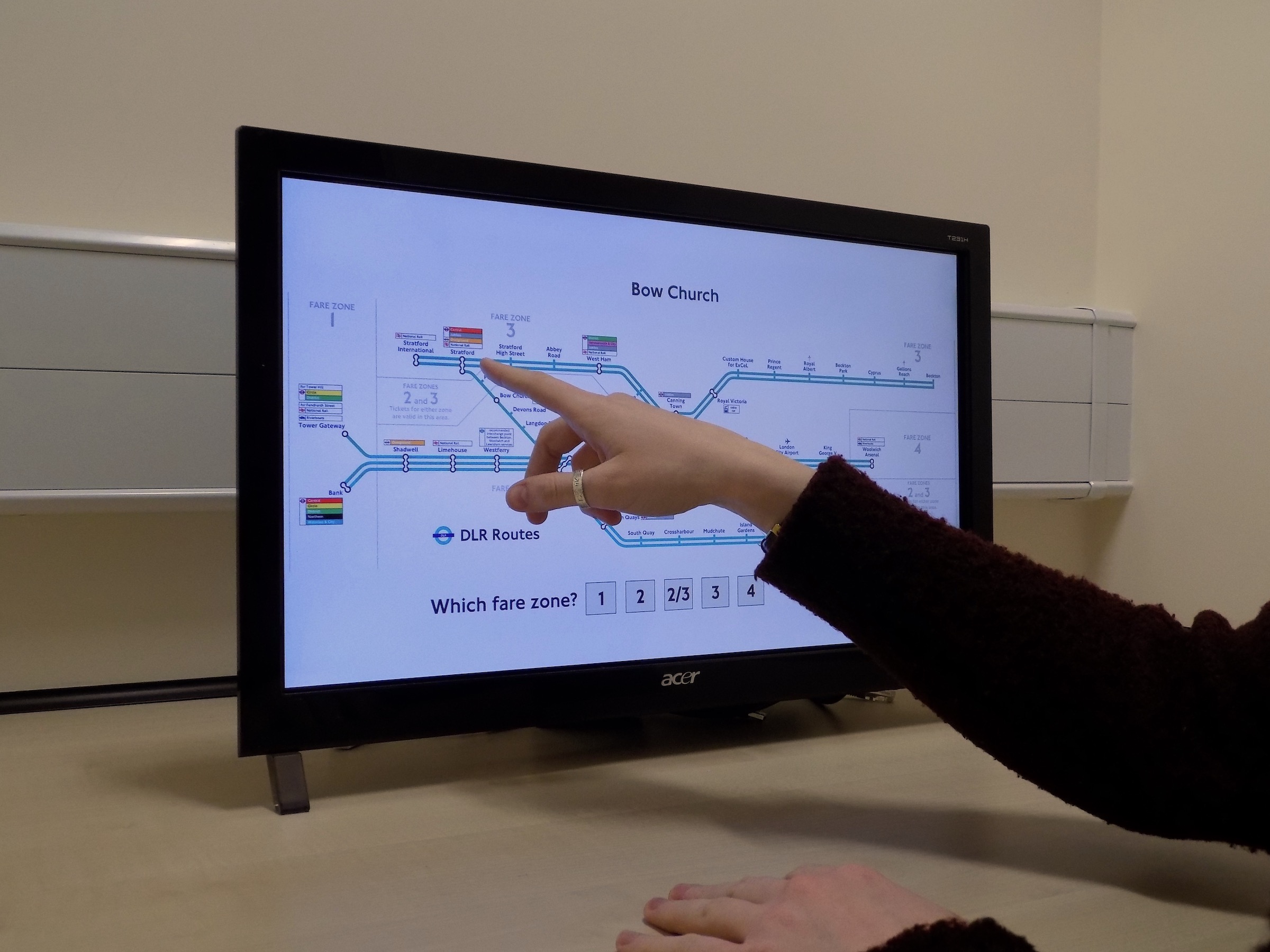
Zone finding task. For each trial, a station name was displayed at the top of the screen. There were five buttons at the bottom of the screen corresponding to the fare zones and people were asked to touch the appropriate one (right).
-
Subjective ratings. There were two further tasks to identify people’s opinions about the maps.
-
Simple sorting task. People were presented
with the car line map that they had previously navigated plus the other three prototypes and asked to place them in rank order of preference. -
Statement rating task. There was also questionnaire with multiple statements concerning the usability of the map that they had experienced. By rating these on a Likert scale (strongly agree to strongly disagree) answers could be scored and aggregated to give a quantitative measure of rated usability.
-
The analysis and interpretation of the major findings are discussed in my peer-reviewed article published in Transportation Research, Section A. A preprint can be downloaded via the following link:
To summarise:
-
The most popular map was the then-
current diagram. However, this was also
the design that was associated with the most errors at the journey planning tasks. This is yet another instance of the finding that preferred designs are not necessarily those which are the most effective. -
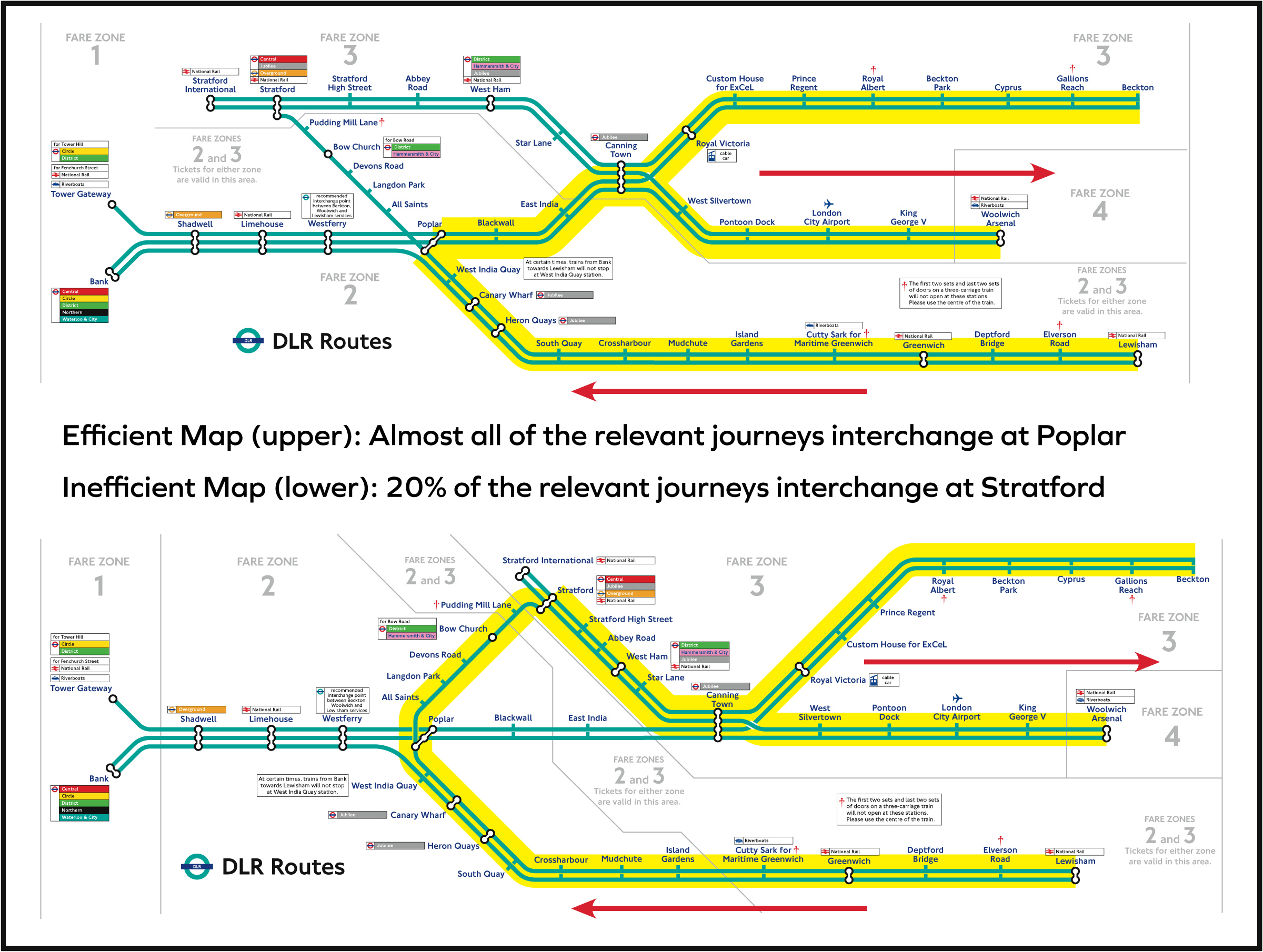
Two of the prototypes were associated with inefficient journeys in certain circumstances. For those with origin stations on the Lewisham branch and destinations on the Woolwich or Beckton branches, around 20% of journey choices were suggested via stratford, a very roundabout diversion. This selection was virtually unknown for the other prototype (above right).

Overall, we found clear weaknesses for three of the train map prototypes giving an easy recommendation for which to adopt.
One possible criticism of this research is that it was laboratory
based: no one actually travelled on the Docklands Light Railway, instead they sat inside cubicles in front of computer screens. In
other words, this research lacked ecological validity. My response
to this is that our research revealed a clear red flag for certain prototypes, and these had no obvious benefits to outweigh those potential costs. There was therefore no clear reason to choose these over the version that had performed faultlessly. The DLR officials obviously agreed. A design based on our recommendations was placed into service on trains soon afterwards.