
I have extensive experience in quantitative user research, focused on the design of transit maps. In
2022, I identified a need to fill in some gaps in my knowledge and enhance my employability, expanding my repertoire to encompass UX design. I chose an online course by the UX Design Institute (based in Dublin) because it included assessed coursework and was university-validated. My primary interest is
the user research aspect of UX design but, having overall knowledge of, and understanding of the entire design process is important. My assignments portfolio from the course is in this section, along with the reasoning behind the decisions that I took.
For the course assignments we were asked to perform a series of UX design tasks, starting with user testing, analysing the data and then planning, implementing and annotating wireframes. I chose the
hotel booking website pathway.
The assignments commenced with note-taking from two videos of people attempting to make bookings through two web pages, followed by conducting a similar test myself. The data were organised using an affinity diagram and a customer journey map.
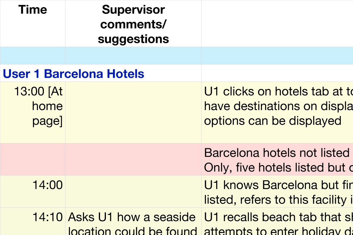
There were two videos of usability tests, each comprising one user navigating two hotel booking websites. These
are available publicly and can be viewed here. Click on
this section title or the image to download a pdf file of my notes/observations constructed while watching the tests.
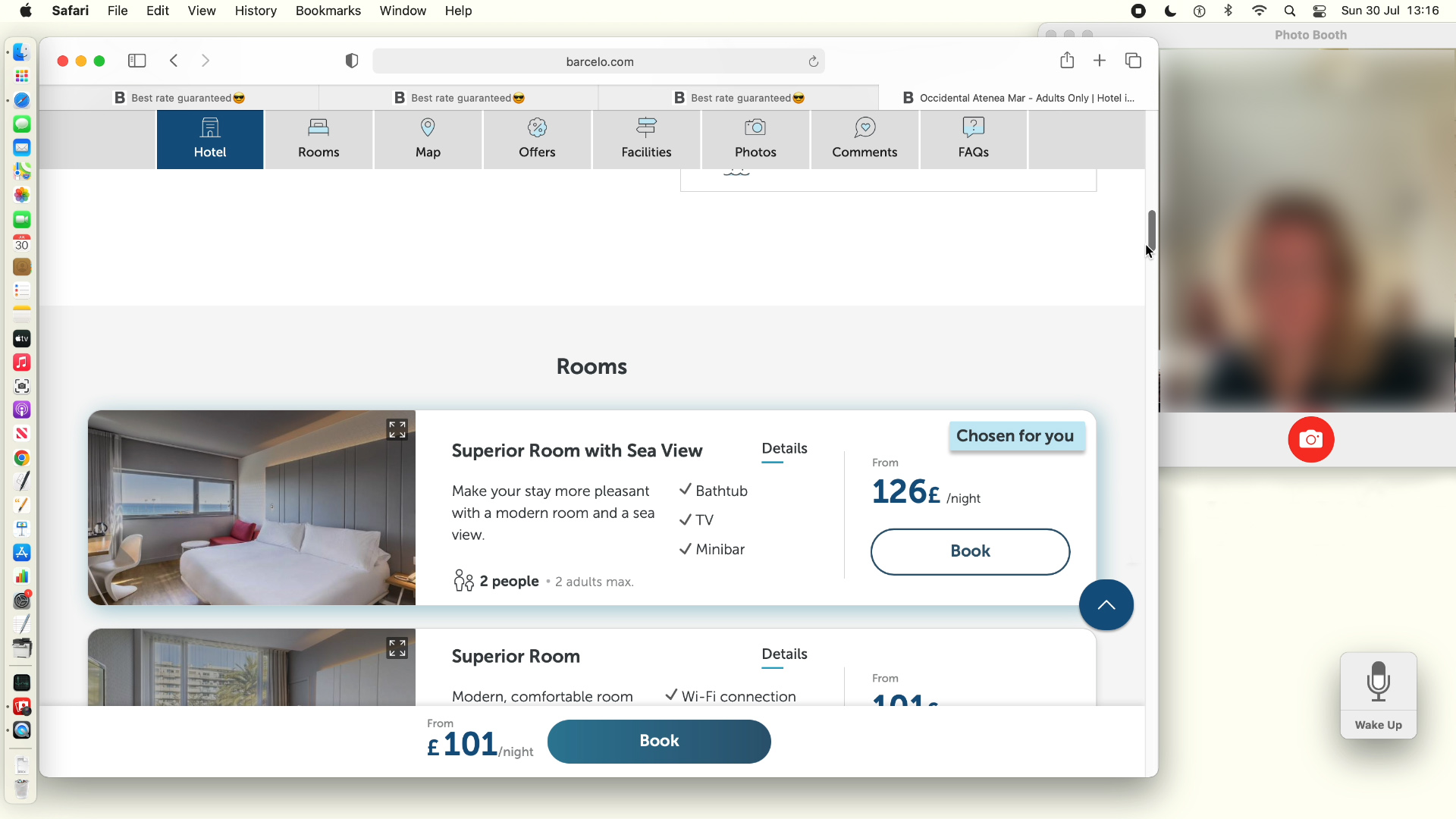
The target websites had been modified since the previous tests had been conducted, addressing some of the worst
of the previous usability issues. Thirty years experience at conducting laboratory experiments pays off for this sort
of task, both in ensuring that the protocol is followed appropriately, and keeping the user reassured/relaxed.

For this task, my background in psychology, and my expertise in information design, including how people make sense of information and why they make errors, ended up driving the construction of the affinity diagram. The data was organised according to the causes of the various issues, therefore pointing to the sorts of solutions that might be necessary.
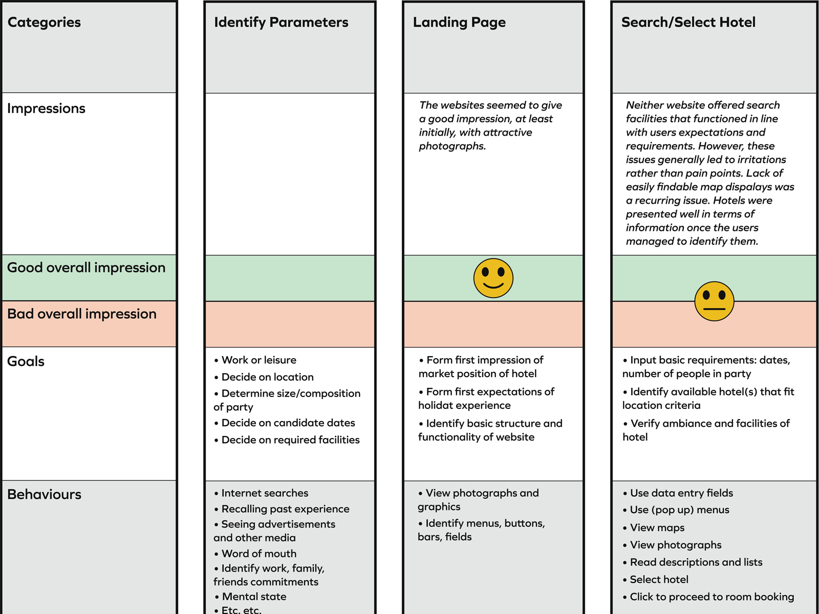
Creating a customer journey map is a means to organise the major findings of usability testing by showing where issues are encountered as users flow through websites.
User experience status is also summarised stage by stage.
Although I had observations for just three people, there were a number of clear recurring usability issues arising from the use of the websites. Four of these could be easily addressed within the scope of the web design assignments.
-
Written information was easy to miss. All-too-often, crucial details, such as whether meals were included, were drowned in a sea of information. With too much information people lose focus, so that the obvious becomes easy to miss, even with the details right in the middle of the screen and flagged by a heading. Adverse feedback loops were often observed, in which the more users failed to locate desired information, the harder it became for them to find it.
-
People disliked scrolling down through many options. This was another symptom of the problem of information overload, this time with too many options to think about. Sometimes this was owing to
a failure to narrow down search, for example presenting users with a bewildering variety of rooms, many of which were irrelevant to their needs. Other excesses were owing to giving users such a long list of ill-thought-through extras that they began to get confused as to what the basic room package actually included. -
Attempts to upsell, if mishandled, could be seen as being less than honest. Hotels differ in what they offer from country to country. For example, twin beds are standard in Spain and there is an extra charge for a double. There is no extra charge in the UK. The risk is that, if it transpires to customers that they are being charged extra for items that they thought would normally be included, this might make them query the integrity of the website.
-
Lack of clear summaries was a barrier to making a purchase. When it came to payment, it seemed as though the developers were assuming that user had identified and memorised all the relevant details of their stay. Taking users to a payment page without clear indications of what was being bought was a clear source of reluctance and disorientation.
 Having identified these issues, I addressed them by structuring
the information on the websites in the following way.
-
Build inputting of the basic stay requirements into the room search options (right). If people actively take ownership of their decisions then they will know/remember what is included – this is what they chose, no need to look for it. Hence, when inputting dates for the room search, users would also be asked for their meal, bed, payment and cancellation preferences.
-
Use the basic stay requirements to narrow down search results and extras. With the information input by the user, the search would be constrained. At an extreme, the user could be presented
with just two pricing options: standard or premium room (along with a very limited list of extras). -
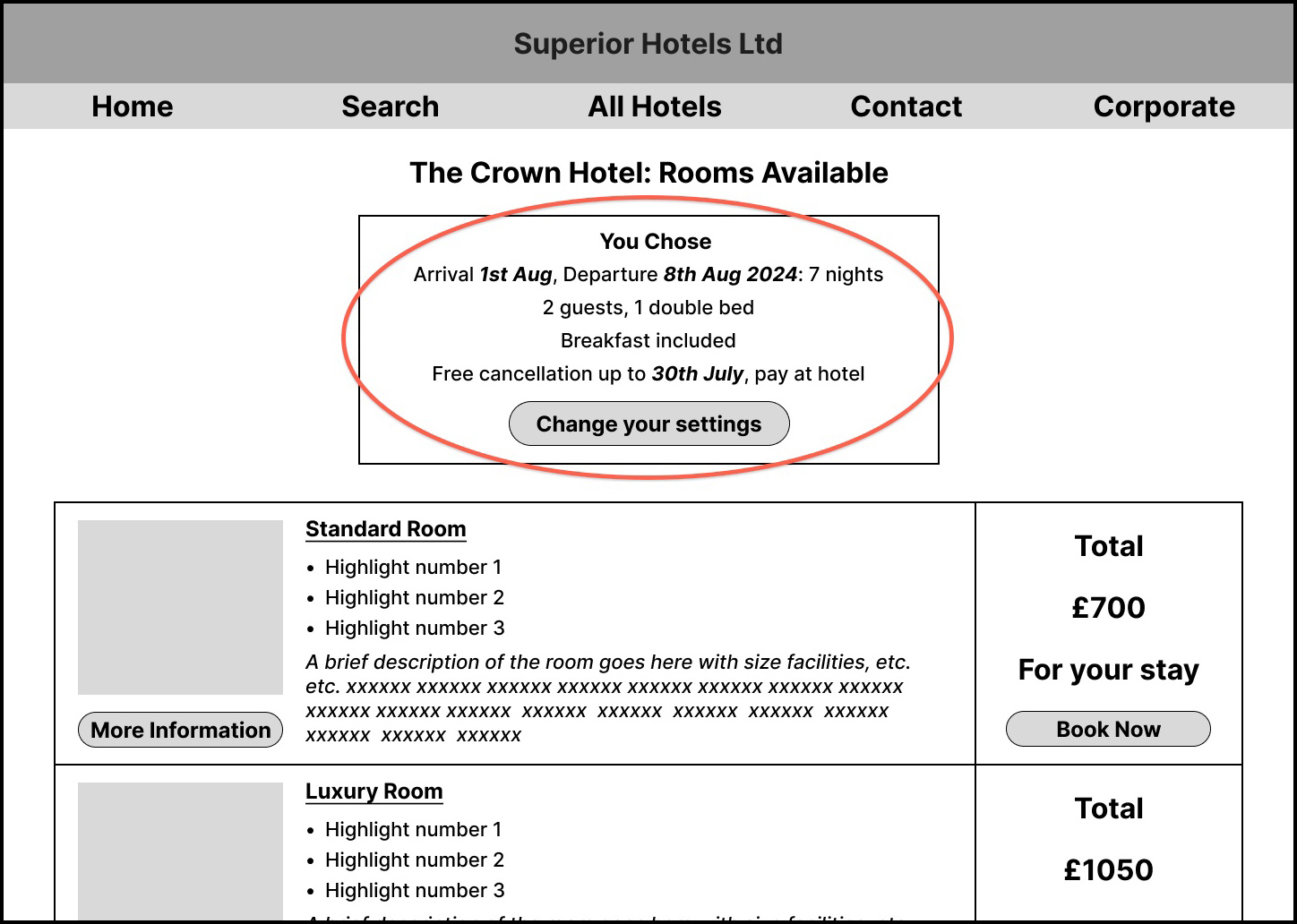 Reassure the user by displaying the basic stay requirements throughout the booking process (right). Once input, the basic stay requirements would appear at the top of each relevant screen. Hence the user would be reminded of the selections
and reassured that they had been accommodated.
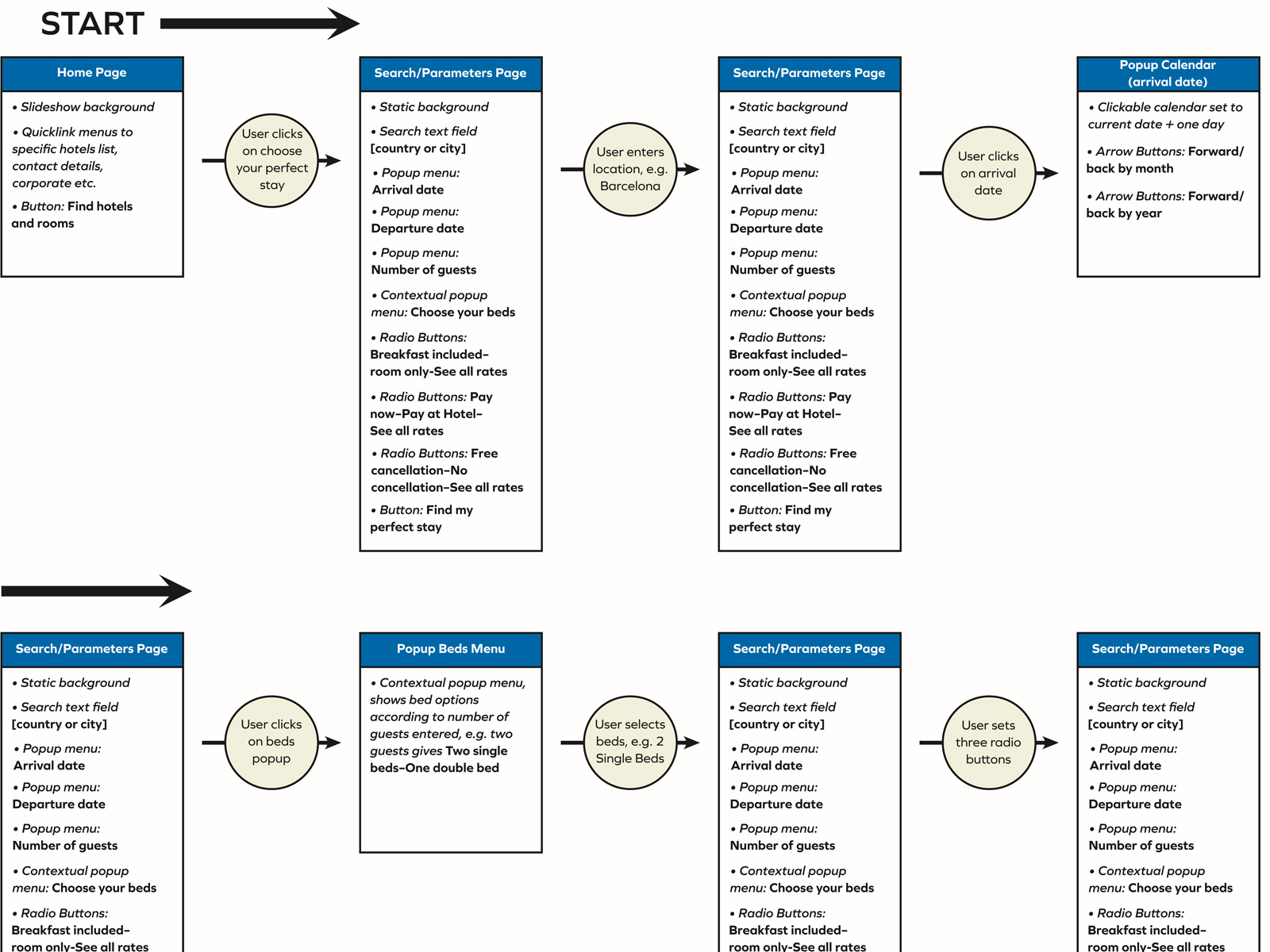
Having identified the basic design philosophy and objectives, the first step in prototyping is to identify
the customer flows for the primary use cases. This is
my basic flow diagram, starting from inputting search parameters, to choosing a room, to getting ready to
input payment details.
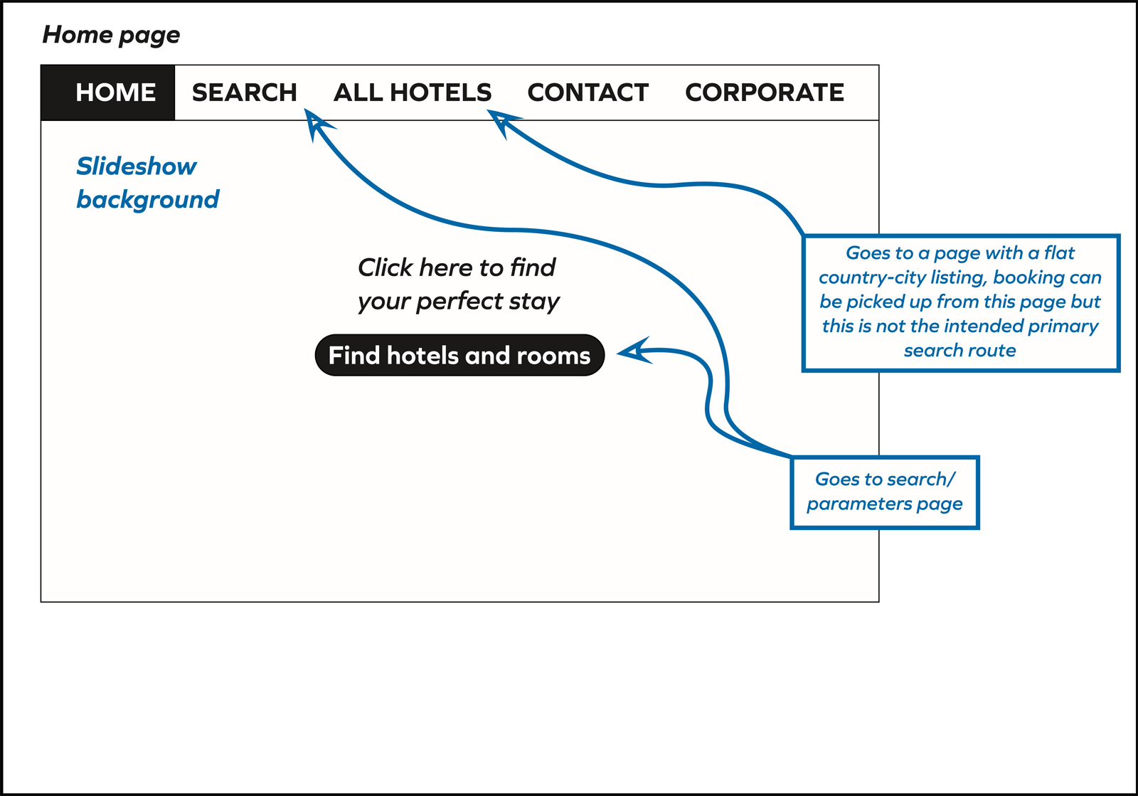
The next step is to sketch a set of wire frames in order
to determine the page layouts for the web site, including text and controls (e.g., buttons and fields). For my own proposed website, particular attention was needed to ensure that the search parameters were clear and, subsequently, consistently displayed, and that users
would not be overwhelmed with information.
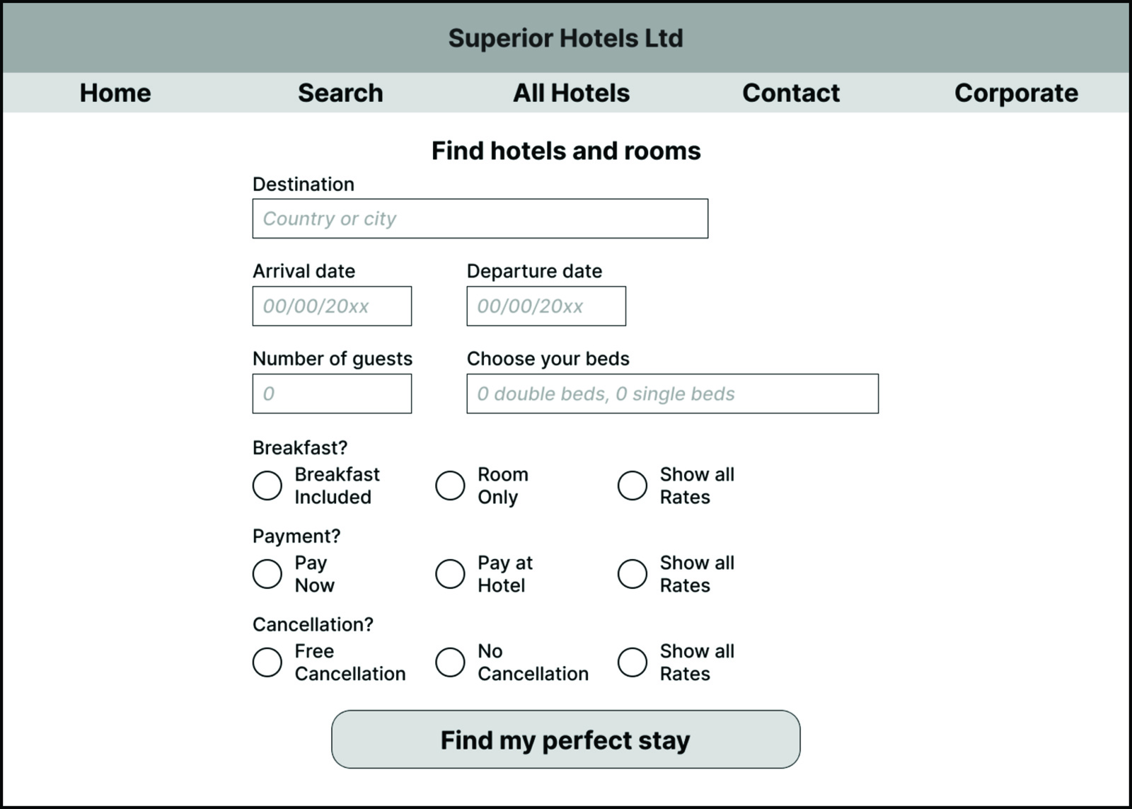
The links here will direct you to a medium fidelity prototype (some functionality implemented) for a desktop website whose wireframes have been implemented in Figma. With this, it is possible to get an idea of the basic look and feel and functionality of the website, along with user flow from start screen to payment.
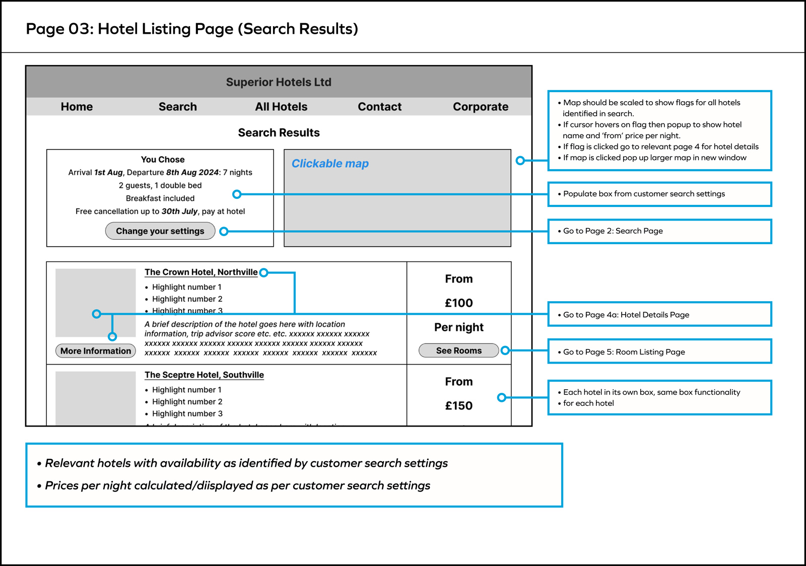
The final step was preparations of annotated wireframes
to send to the developer to implement the website with full functionality.
It would be impossible for a person with thirty years experience at implementing and teaching research methodology not to have some opinions on this up-skilling journey. These are my four most outstanding ones in the context of the coursework.
-
Nothing else is more important than keeping cognitive load under control. Findings on the effects
of cognitive load on performance are well-known in psychology, but overloading the user is a surprisingly common issue for information design. Many people seem to have a belief that if one
piece of information is helpful then ten pieces will be ten times as helpful, and that yet more can be added without cost to the user. When content gets out of control I call this Information Pollution. -
I don’t have much affinity with affinity diagrams. These seem to be a popular method for making sense of large quantities of unstructured, diverse qualitative data, but I have some concerns with their use. Briefly, Affinity Diagrams were devised for making sense of new domains in which the researcher has not yet developed insights. In other words the researcher does not yet possess a conceptual framework for organising and making sense of the observations. Research into the psychology of expertise shows that people who lack conceptual frameworks perceive and organise information according to superficial surface qualities rather than underlying deep conceptual properties. In other words, if you are in a situation where you lack a conceptual framework and must use an affinity diagram to make sense of data, you risk finding answers that are superficial and basic rather than deep and powerful. Hopefully, repeated use of affinity diagrams will bootstrap forming some sort of useful conceptual framework.
-
Over-marketing can be counter-productive. For too many hotel websites, including the ones here,
the marketing philosophy appears to be to aggressively up-sell, using the Ryanair business model
of a low headline price but clawing back the savings with hard-sell of extras (including items that customers might have expected to normally be included). For people invested in this philosophy, reigning in such activities to give the user simpler decision making might seem like sacrilege. However, the testing clearly showed that charging for unexpected extras was very bad for the overall user experience, to the point that honesty and integrity of websites was being questioned. -
To me, Figma appears to be overrated. I was very disappointed with Figma, which gave me the impression of being an online vector graphics package (a very good one) with some web design bolted on as an afterthought. As such, it lacked basic functionality that was available to me, easily scripted, in Apple Hypercard from over thirty years ago. For example, the gymnastics (aka kludges) necessary to create a set of functional radio buttons or a workable text field were simply absurd and, in the end, I submitted the website with these unimplemented. If you are reading this, you already know that I can program a fully functioning website.