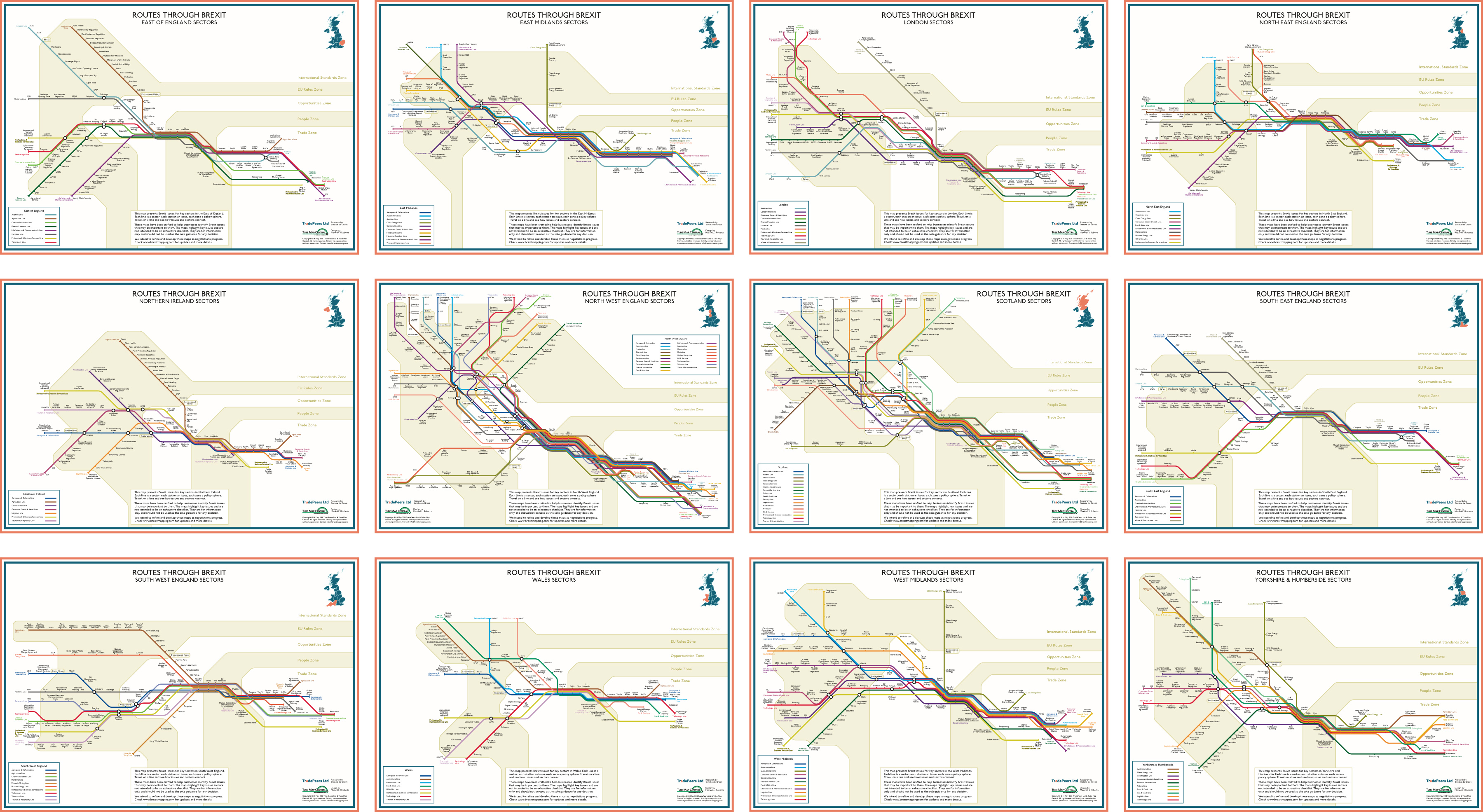
I was approached by Sietske de Groot of TradePeers Ltd, in 2017, to investigate applying the transit map metaphor to issues faced by businesses preparing for Brexit. The overall objective was to harness the ability of transit maps, such as the London Underground map, to highlight network structure and connectivity. By applying the transit map metaphor to show to Brexit issues, these would be made salient and the challenges shared by businesses in different sectors would be emphasised. It was also hoped that these designs would inherit other psychological positives of transit maps: powerful, attractive imagery that captures attention and encourages engagement and discussion.
-
Data were supplied by TradePeers Ltd in the form of matrices on a region-by-region basis comprising key business sectors for each region and the Brexit issues they faced. These were
grouped into five categories (trade, people, opportunities, EU rules and international rules). -
A prototype map (based on Cheshire) demonstrated proof of concept and enabled us to finalise basic specifications and design principles, including …
-
using lines to represent individual business sectors, stations to represent issues, and interchange circles to denote shared issues would create logically coherent designs
-
treating the issue categories as zones would greatly assist in the organisation of each map
-
-
the issues in the trade zone and, particularly, the people zone were widely shared between sectors and these could be treated as a central spine, further organising each map
-
Principles of effective transit map design, identified
by my research, were applied to maximise clarity wherever possible, comprising …-
simple, straight trajectories for the lines
-
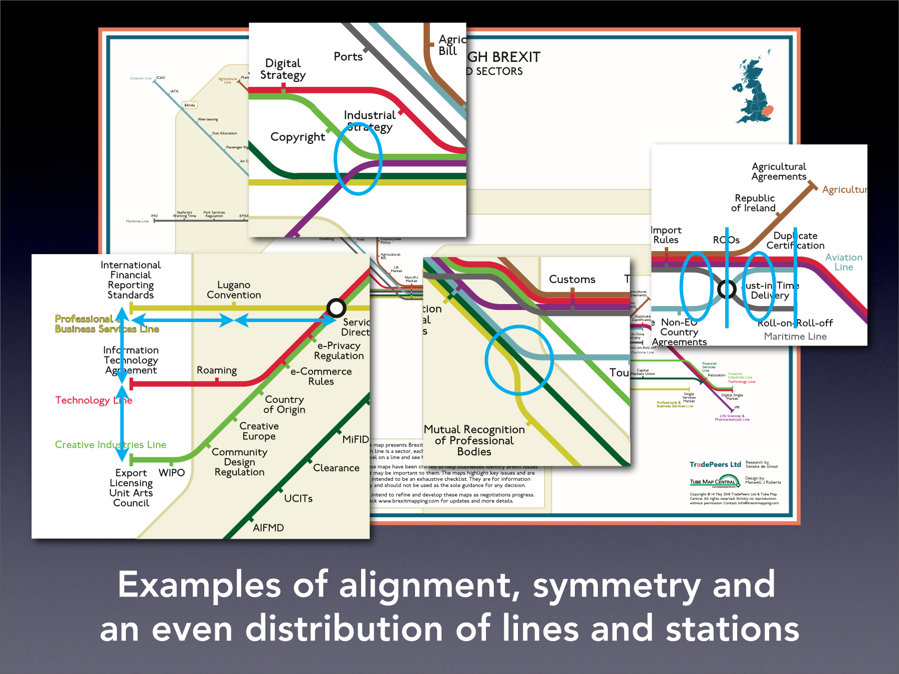
using alignment, symmetry and an even distribution of lines and stations to maximise
the overall coherence of each map
-
-
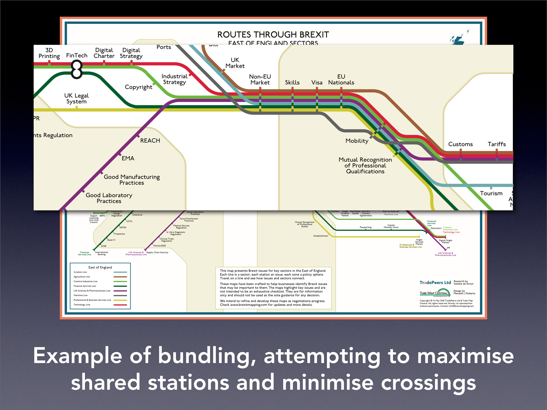
with many issues shared between sectors, care with bundling (adjacent lines running in parallel) was important to maintain coherence – the
order in which lines are placed together should maximise shared stations and minimimise lines crossing others when they leave the bundle -
away from bundles, line crossings were minimised and where these had to occur it was attempted
to minimise visual disruption by confining these to transfer stations, or else have them occur at the peripheries of zones
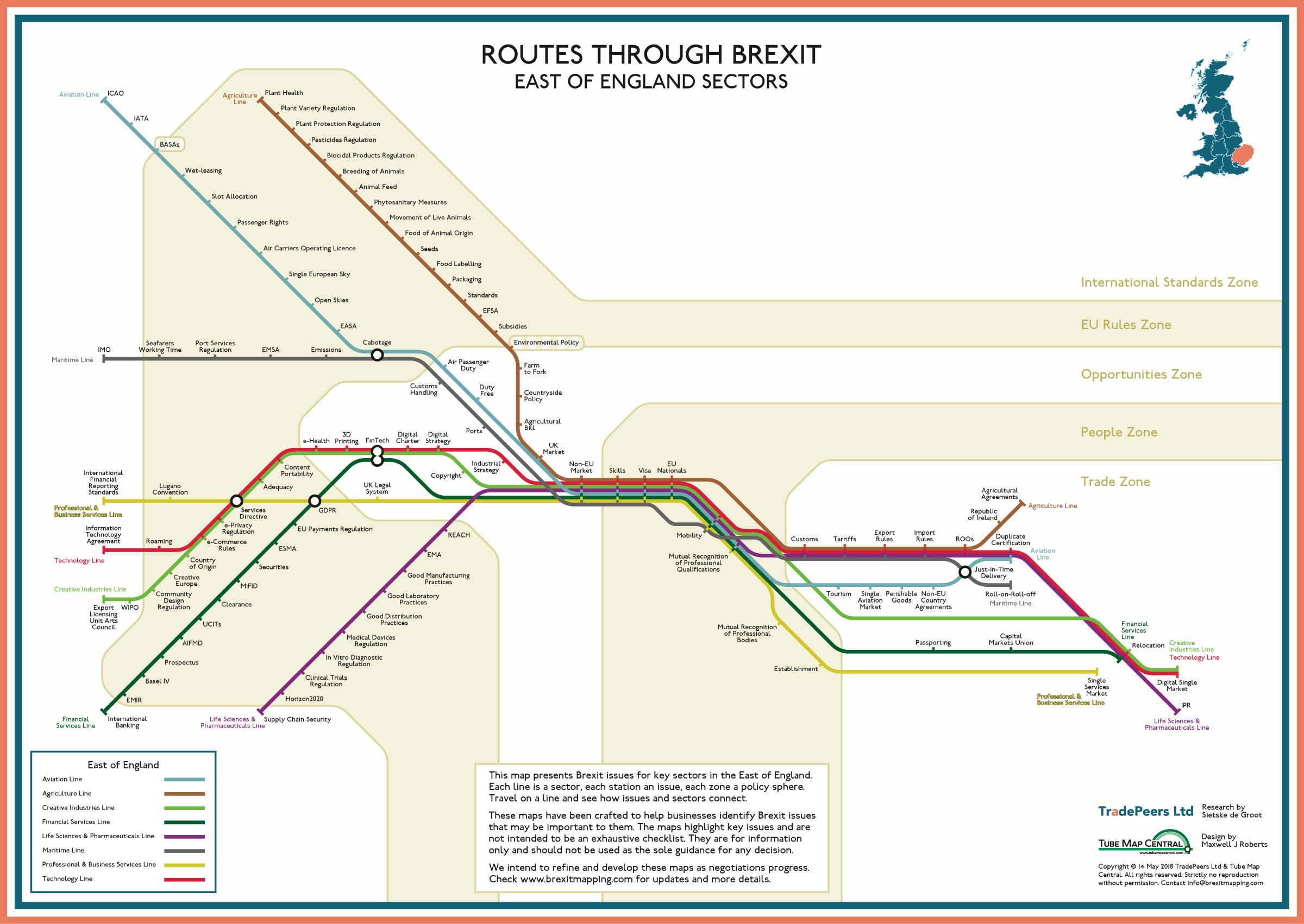
Twelve regional maps were created showing the key business sectors for each region, the challenges that they faced, and how these intersected between sectors. The maps were extensively used by TradePeers Ltd in their training materials. Individuals were invited to follow lines representing their own sectors to identify, at a glance, the issues that they faced and and also to see where expertise might be shared with other sectors. The maps were, indeed found to be engaging and highlighted the need to plan ahead.
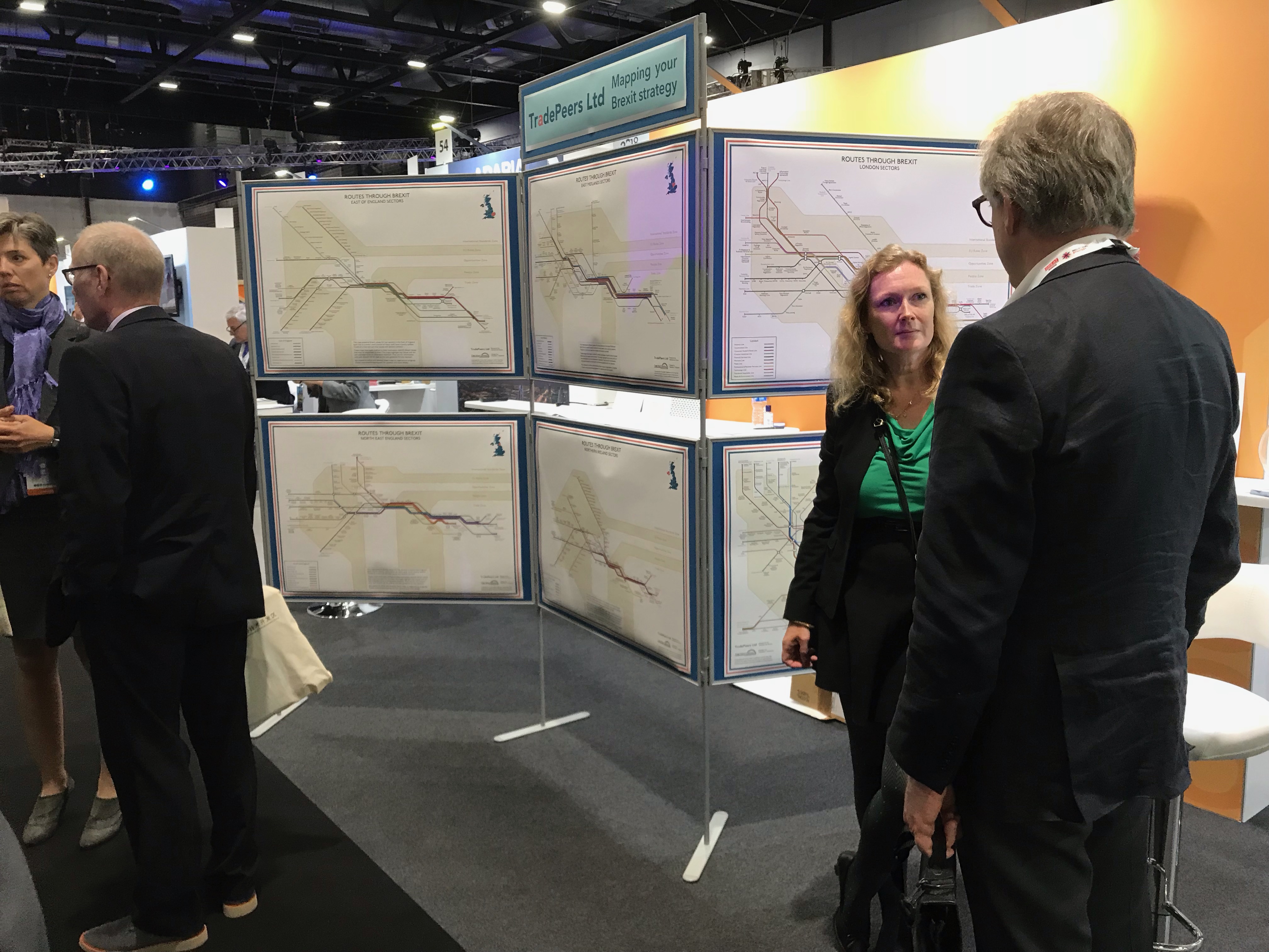
Interestingly, we found that the construction process itself yielded several additional insights. Looking across the twelve regional maps, we were able to identify that certain geographical regions of the country would be faced with proportionately more Brexit challenges than others, and also that some regions would have fewer instances of common expertise shared between sectors for addressing them. These observations were not made accidentally. The very act of researching and creating logically coherent maps provides excellent opportunities for learning and insights.
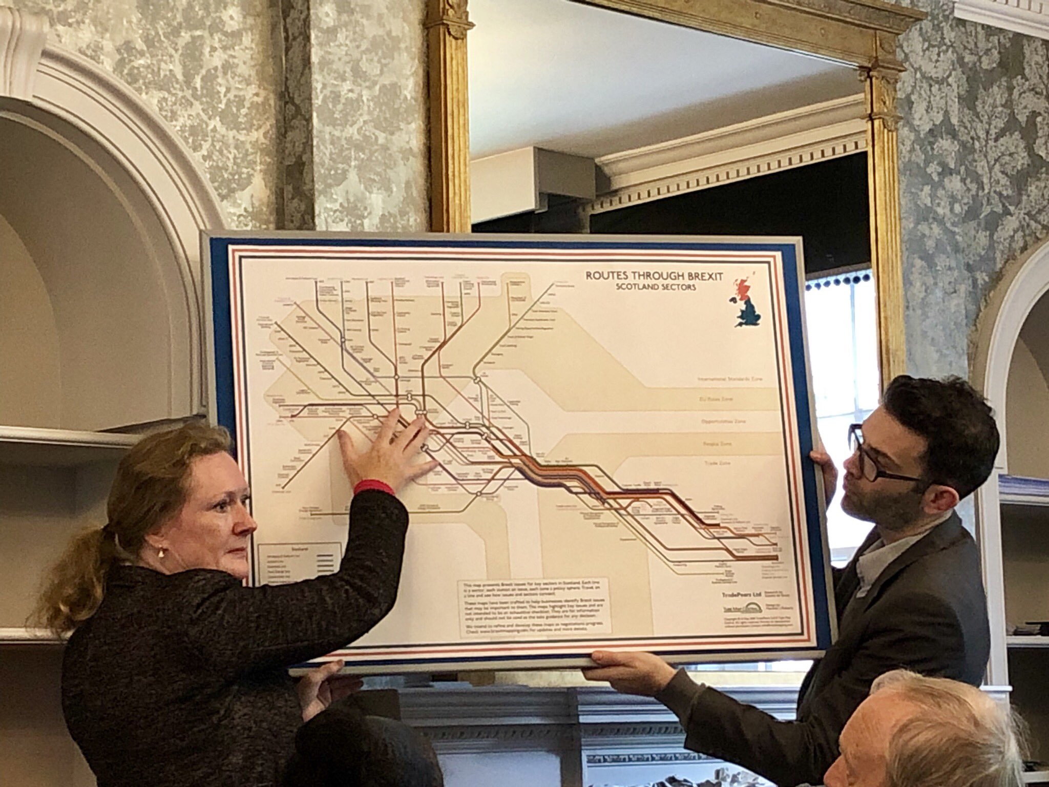
Sietske de Groot writes:
I got the idea of using the transit
map metaphor for my own work at one of Max’s workshops.
I advise businesses on customs procedures and international trade and, as a result of Brexit, I needed to convey a lot of information on customs, cross-border travel, and changes to regulation, so my clients could adapt their business models quickly. The information was not only complex, but also the acceptance of the required changes varied from business
to business.
Visualising all aspects of operating in a ‘third country’ after Brexit was a unique challenge. I had to think about how to categorise changes and how they impacted different regions and sectors of the economy. We created data matrices that Max could visualise. After populating one for each region in the UK, twelve Brexit maps were created. The results were stunning and engaged and delighted people of all Brexit viewpoints. My clients could easily identify the structure of the changes needed and they understood the urgency to start implementing them for their business.