I am a keen advocate of evidence-based design, and this means high quality usability research, not just to identify the best maps from amongst prototypes, but also – and this is much more challenging – to be able to identify useful, valid general principles for effective design. This cannot be achieved by waiting for other people to create suitable interesting maps to test, the researcher must play an active role in designing maps for testing. I also believe that, just because the London Underground map has been designed in a certain way since 1933, this doesn't mean that its design rules are the perfect way to map every transport network for every city. There is a whole universe of design rules waiting to be explored, and the only way that we will know which ones to use is by visualising and testing them.
From my own research, I have evolved a framework for effective design to provide a means by which design priorities can be identified and applied, and which also enables pre-existing designs to be critiqued in a principled way. The framework guides the production of matched-priority maps for subsequent testing using systematic exploration/construction to generate prototypes. It would be impossible to summarise all the design methods that I apply, but this section attempts an overview.
The framework identifies and categorises the key design parameters of transit map layout. It is not a theory of design because it does not prescribe which criteria are the most important – indeed, some may be in conflict. Instead, it is intended to provide a checklist of things that matter about the layout of a map and that might (or might not) affect its usability. It comprises five components:
-
Simplicity. The key requirement for a schematic map is that it converts the complex trajectories of reality into simple line trajectories on the diagram. Hence, these will be easier to discern and follow, likewise their interconnections and broad pathways, so that the overall structure of the network is,
in turn, easier to identify and learn. -
Coherence. This is a higher-order holistic criterion that refers to the way in which lines relate to
each other to give the overall design good shape. Features which improve this include parallel lines, symmetrical divergence, alignment of stations and termini, and a regular foundation such as a grid. -
Balance. Ideally, there should be an even density of stations across the map, or at least gentle density gradients, so that congested and empty spaces are not adjacent and attention-grabbing. The natural consequence of attempting to create a balanced design for an extensive network,
with a clear central focus, is that the centre will be enlarged and the suburbs compacted. -
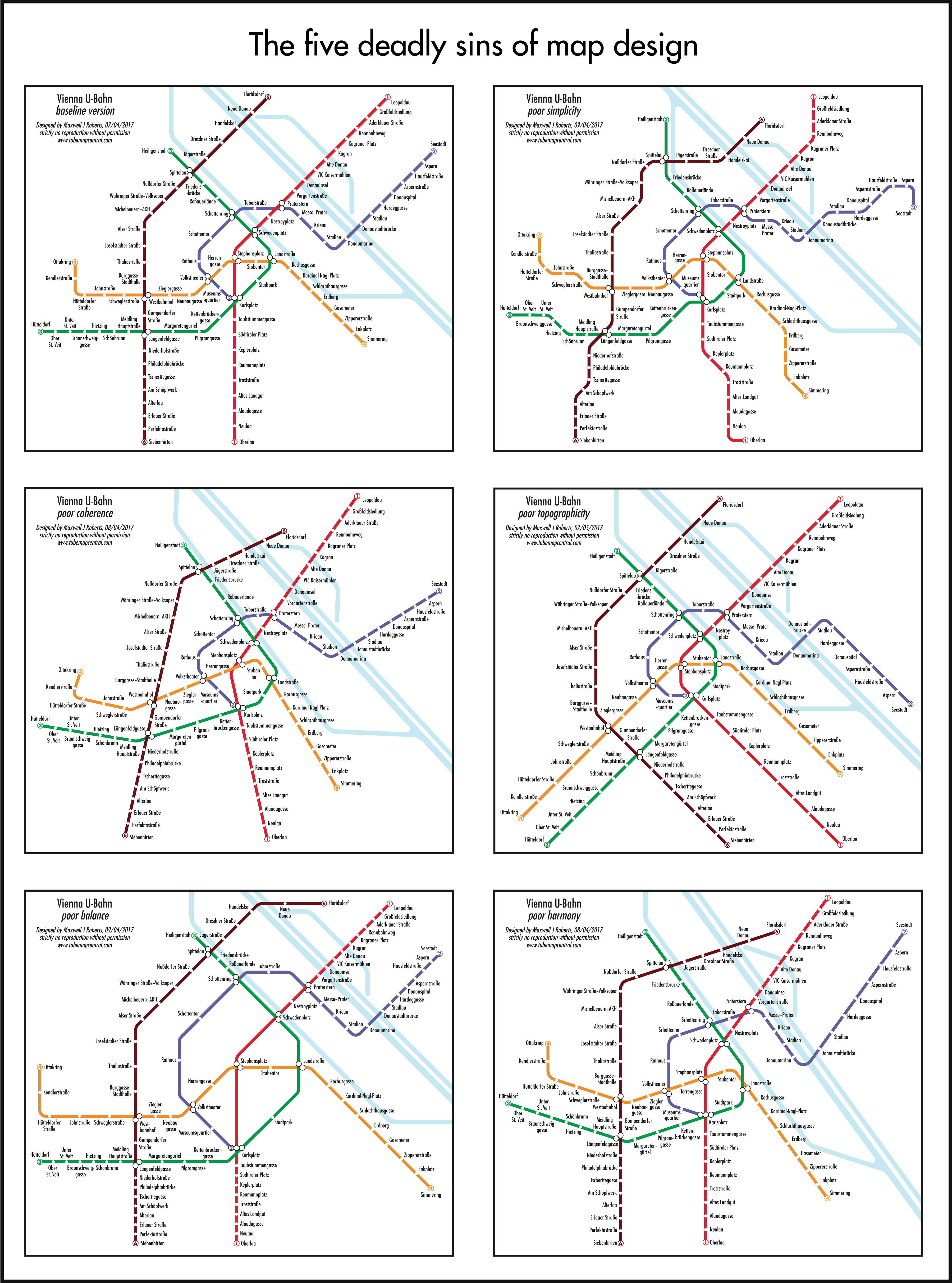 Topographicity. In order to optimize a map according to the above criteria, some geographical distortion is inevitable but, if a designer goes too far, then poor topographicity is the result. There are considerable individual differences in tolerance to this but, if distortion is extreme, then this will conflict with user mental models of a city and adversely affect their confidence in the design. Even worse, it might lead to the planning of inefficient or inappropriate journeys.
-
Harmony. This is a placeholder category for aspects
of a design that are likely to influence its aesthetics, but are unlikely to have any impact on usability. For example, angles that permit equilateral triangles
might be preferred over ones which result in tall,
thin isosceles triangles. Similarly, angles that permit perpendicular line crossings might be preferred to angles that do not. User-acceptance is an important aspect of schematic maps. An otherwise impeccable design will have failed if it is rejected by users.
The key point of the framework is that it is neutral with respect to the design rules. If a map is easy to
use then this is because the framework criteria have been satisfied. If it is difficult to use then they have
not – maps that fail each of them are illustrated above right. Of course, some design rules might have a usability head start in this respect compared to others, such as London design rules (horizontal and vertical lines plus 45° diagonals). However, without exploration and research, how can we be so sure that this way is best? Where is the evidence? Popularity is not usability.
 Having identified the criteria that need to be satisfied to create an effective design, we then need to decide on the design-rule-tools available to address them. Rather than blindly trying different approaches on a whim, we need a taxonomy to guide the search. The next cornerstone of my thinking was to define the space of possibilities in terms of the level of linearity of the design rules. Hence, the lowest level is tetralinear (or rectilinear): maps with lines at two different angles. Designs with three angles are hexalinear. Next are the London design rules: maps with lines at four different angles are described as octolinear (or octilinear).
 Higher levels of linearity are possible and these relate back directly to the framework for effective design. More angles can yield greater simplicity,
but at the expense of coherence. Octolinearity (as per London) is a good compromise in this respect, but is this going to be the case for every city?
 Schematisation need not be based upon straight lines. Other possibilities include curvilinear maps – designs with no straight lines at all. My curvilinear Paris Metro map has consistently out-performed the official octolinear version (see my research page). Here, the reasoning is that the official map fails to simplify Paris, turning twists and turns of reality into complex zig-zags. Presumably, this is because the Paris network is particularly convoluted and interconnected. The intention for my curvilinear map was to smooth away the corners, leaving gentle curves instead. Another possibility is maps based on concentric circles and spokes. Although visually powerful, and popular with the media, they seem to have usability issues. In the case of Cologne, the city itself is organised exactly in this way (above right). Based on my research, KVB, the Cologne transport authority, adopted such a concentric design
in 2022. Compared with the octolinear map, this works synergistically with the city to highlight its structure.
 Systematic Exploration Methodology
My starting point is that every transport network differs in structure, connectivity and topography. Therefore, for every city, it is necessary to identify
the design rules that permit the most effective optimisation, satisfying the criteria specified by
the Framework for Effective Design. Matching
the design rules to city structure is achieved by systematically prototyping at different levels of linearity (plus non-linear schematics) ruling out obvious failures and subjecting the remainder to user-testing. An example for Washington, DC is illustrated (right). With the advance of computer techniques, eventually it will be possible to score maps according to how successfully they fulfil the criteria but, until then, a combination of design intuition and empirical testing will be needed.
As a result of many years of experience at creating schematic maps, I have developed the skill of rapid prototyping. For example, investigating the Berlin U-Bahn/S-Bahn network I was able to complete a full design sequence within two weeks: each map requiring two days on average. The process is as follows:
-
Ideally, I visit the city myself: exploring the network, surveying the interchange stations to get an idea of the (in)convenience of the transfers, investigating the most important stations to see where people want to go – or don’t want to go: Stadtmitte in Berlin (literally, City Centre) is a desolate, empty place: a rare example of an empty geographical centre.
-
I always obtain a topographically accurate map of the network. This will give indications of its broad structure and its quirks (e.g., Cologne’s concentric circles, Amsterdam’s concentric U-shaped canals, Paris’ tilt). I keep the map in view during the design process to ensure that topographical distortion is kept under control.
-
I decide parameters such as station and interchange symbols, stroke width of lines and font/ font size. The London convention of x-height of font matching stroke width is a good starting point.
-
Before any attempt at laying out the lines, I always place the station names roughly in appropriate spots. In reality, railway lines do not need to swerve around station names a scale half-mile wide but, on a schematic map, these have to be built into the process and accommodated right from the start.
-
I start to lay out the lines at the chosen angles, identifying and approximating broad trajectories, taking opportunities to simplify these, and ensuring that lines converge and diverge appropriately.
-
I identify the most complicated looking interchange station and start there. The hardest parts have to be tackled first. Rebuilding a map to retro-fit neglected central complexity is just not possible:
it is easier to start again. -
I spread outwards from the completed area towards to the next nearest, most complex regions, keeping the design compact but legible. If possible, I try to work to a notional grid in the centre, building in coherence at an early part of the process. In reality, compromises in the centre owing
to complexity often limit the application of such measures. -
Spreading out from the centre into the suburbs, I maximise opportunities for coherence: parallel lines, symmetry, equal spacings and alignment of stations. I try to space stations in the suburbs roughly the same as the centre: an over-expanded centre and over-compacted suburbs can unbalance the map.
-
Next I finish off the map, neatening alignments and positions of station symbols and station names, adding parks and rivers as appropriate (depending on what I can glean from local preferences), and then I begin the next design.
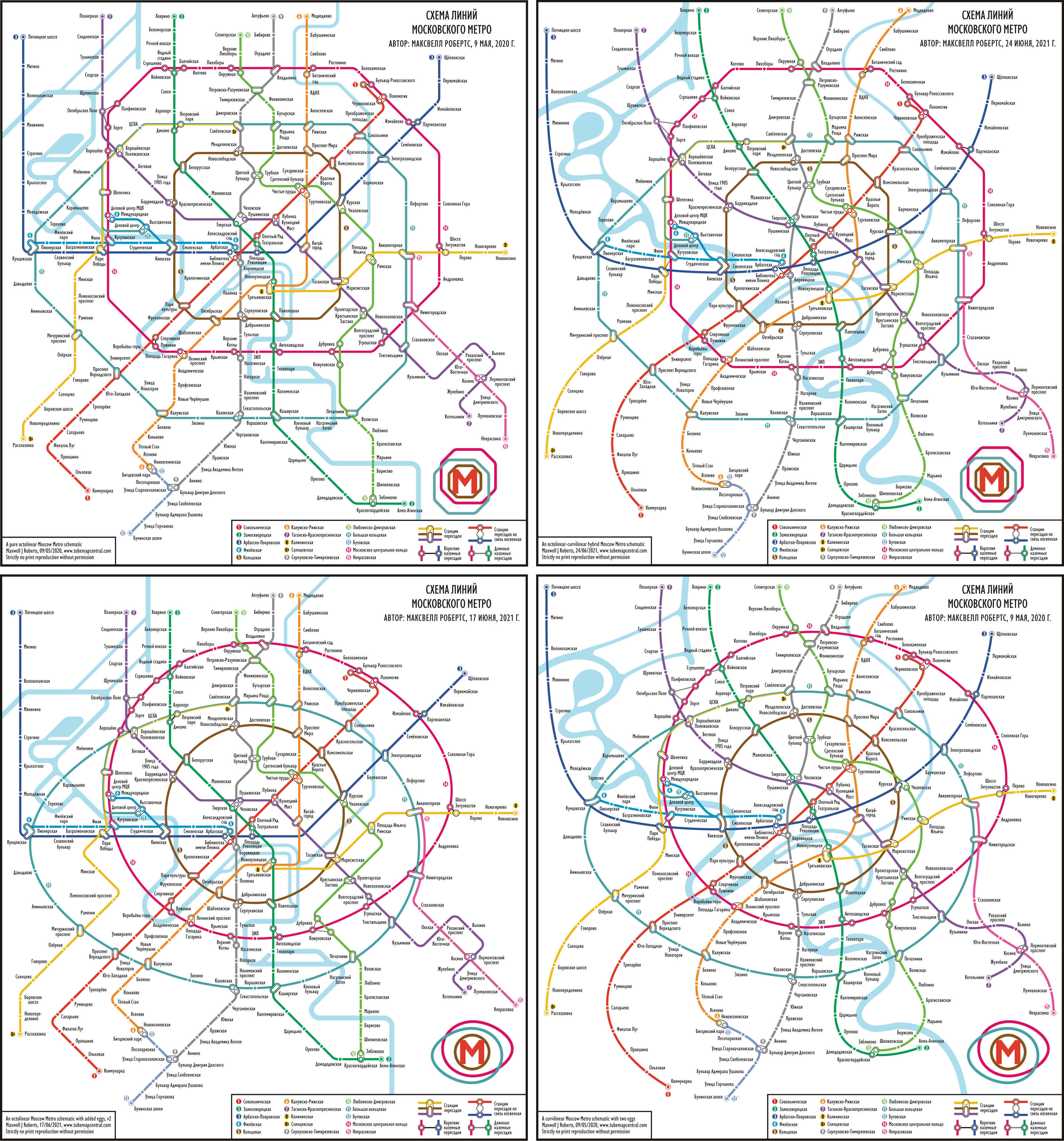
Systematic exploration need not be confined to different levels of linearity, as per the taxonomy above. For example, I completed an investigation of the Moscow Metro network, with a particular interest in how best to depict the new circle lines then under construction. Structurally, keeping topographical distortion under control, the simplest curve to depict each new circle was egg-shaped. I therefore created four different maps, contrasting circle lines with radial lines and systematically exploring
the four possibilities:
- Circle Lines: Octolinear; Radial Lines: Octolinear
- Circle Lines: Octolinear; Radial Lines: Curvilinear
- Circle Lines: Curvilinear; Radial Lines: Octolinear
- Circle Lines: Curvilinear; Radial Lines: Curvilinear
My visual interpretation of the designs was that the maps with octolinear circle lines were surprisingly weak and disordered in appearance. The egg-shaped circles were structuring the map and depicting the network far more effectively, and blended happily with octolinear radial lines – good hybrid-rules maps
are usually difficult to create. Of course, user-testing would be essential to investigate my hunches. No designer, no matter how experienced, should make assertions unsupported by evidence.