Illustrated books are challenging to produce because the text and illustrations need to keep pace with each other. If either starts to run away then the synchronicity between the two breaks down. I learnt this the hard way during production for my first book, Underground Maps After Beck (published in 2005). Fortunately, my publisher was happy to liaise with me directly over the various issues that arose during production and, using Quark Xpress, I was able to fix these. In the process, this laid the foundations for
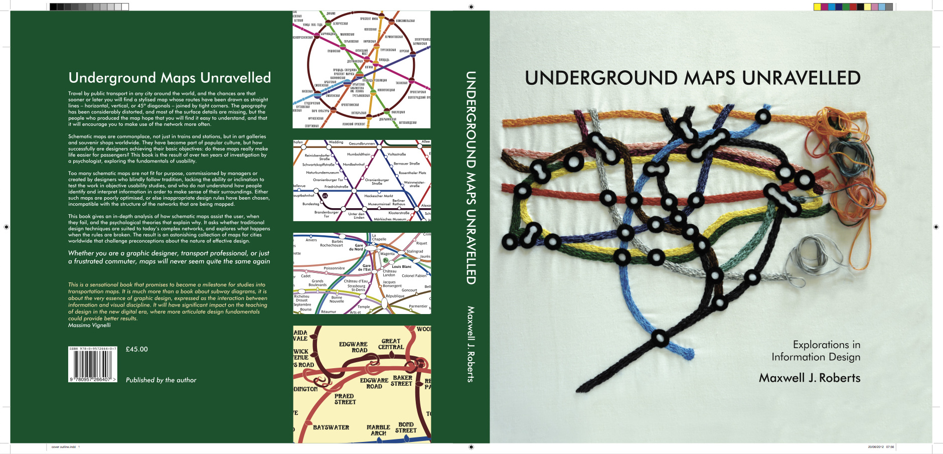
my learning the art of writing to the layout. With these lessons learnt, my two books Underground Maps Unravelled and Tube Map Travels were entirely designed by myself.

I commenced production of this book in spring 2010. It was intended to be a personal take on what I had learnt from my map explorations over the previous decade, and
I took the unusual decision to self-publish. I worked on every aspect of getting the book to market including: authoring; illustrations work; engaging freelance editors and proof readers; arranging printing; and sales and distribution. Fortunately, I had an experienced and able mentor: Doug Rose, of FWT Studios. This was essential just to get to grips with the dark art of colour reproduction. The book was published in 2012 with a print run of 2000. At the time of writing just 20 copies remain for sale.
 Adobe InDesign CS4 was used to lay out text and illustrations. All aspects of the book were my own decisions including fonts (with spacing and leading), grid, styles and basic layout rules. I made full use of features such chapters and have reached a high level of proficiency with the software. There were no issues in printing the book despite the large number of vector illustrations. Self-publishing enabled me to apply some creative flourishes that wouldn't normally have been possible. For example, each one of the chapters has conceptually appropriate fonts and graphics for their introductory spreads and also for their page numbering. I was also able to indulge one of my obsessions. There are no hyphenated words anywhere: every sentence has been written, and rewritten, so that this is unnecessary.
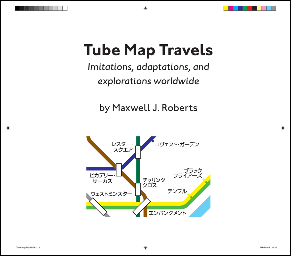
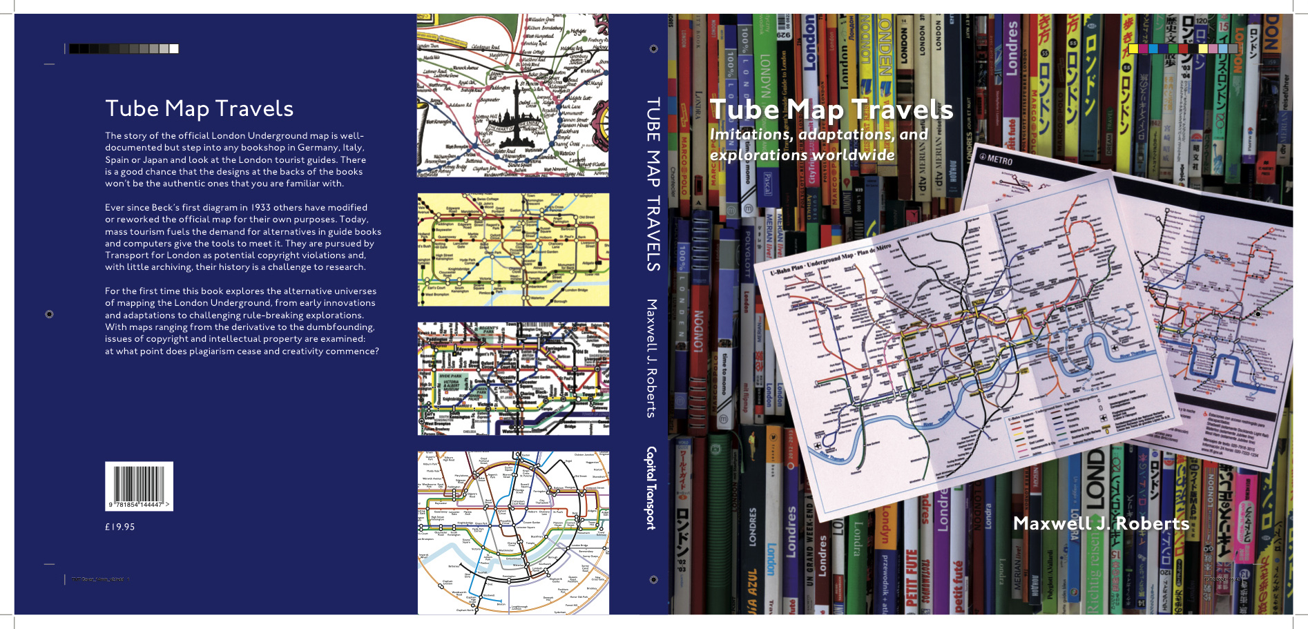
For Tube Map Travels I returned to my original publisher, Capital Transport Publishing, but again with another very personal book, this time documenting my collection of unofficial London Underground maps, i.e. not published by London Transport/Transport for London. In this context, taking full control of the design of the book was entirely appropriate and my publisher was very happy for me to undertake this. Adobe InDesign CS4 was again used and all layout decisions were my own. Production commenced in earnest in Summer 2019 with publication at the end of the year. The challenge for this book was the very large number of scanned illustrations. Often these were printed cheaply using four-colour process and a lot of touching up was necessary to ensure that they were of sufficient quality for reproduction. Again, there were no issues printing from the final pdf file.
 An unfortunate side effect of my background in page-
layout, along with my desire for carefully crafted text,
is that I find web design unpleasantly anarchic: there is much less control over text formatting, especially for responsive websites, and the outcomes can often be quite nasty for body text. I have tried to avoid this as much as possible on my own web pages, with specified fonts and styles and a controlled layout. All pages are thoroughly checked on multiple devices for issues such
as overly ragged right-hand margins, with line-breaks inserted as necessary to ensure that all of the text is well-behaved.