
The first Tube Map Central web page went live in 2005 to publicise my book, Underground Maps After Beck. It was self-coded in HTML, my past experience using UNIX text formatting mark-up codes and scripting Hypercard software (known as stacks) proving invaluable. From that time, the web pages developed and expanded haphazardly as I added maps, writing and newsletters. The intention was to make all my map-related work and thinking available in one place and, later, generate income from
book and poster sales.
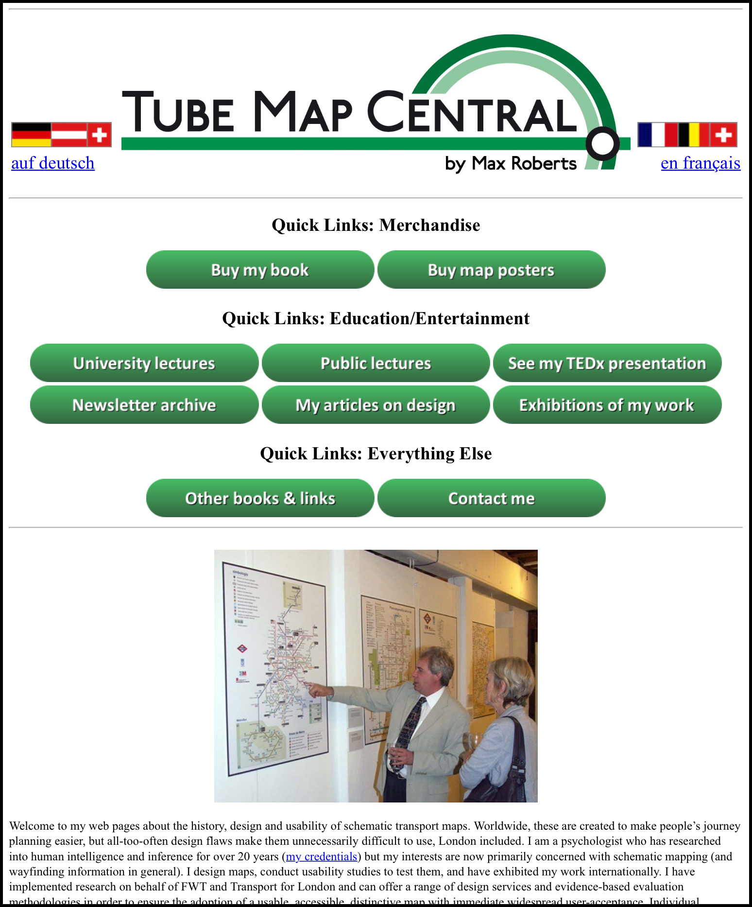
Twelve years later, it was clear that the considerably expanded website was no longer fit-for-purpose (below, left) – indeed, I was receiving complaints from users attempting to navigate it. I therefore undertook a complete revamp. The income generated was never going to justify a cutting-edge third
party extravaganza, and my objectives reflected this. The completed site went live in 2017.
-
A clear, consistent organisational structure with topics placed so that they made sense, giving clear, logical navigation
-
Scope for expansion of topics without having to reconfigure the organisational structure
-
A clean, uncluttered interface with a consistent ‘corporate identity‘ applied to logos, navigation, buttons and fonts
-
Easy to keep up to date by myself without needing to liaise with third-party developers
-
Future-proof: unlikely to be broken by the latest technological developments resulting in less need for maintenance
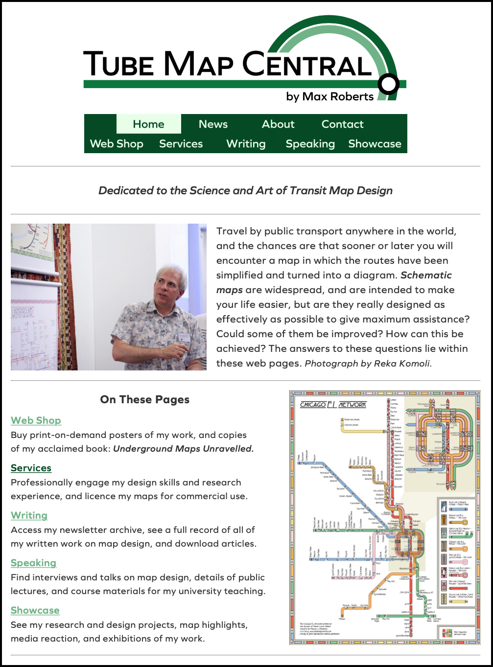
The logical structure of the web pages was identified using card sort tasks to group topics, attempting a compromise between numbers of header-categories versus subtopics. All visual elements (logos, nav-bars and buttons) were redesigned simultaneously, from scratch, to get consistent look-and-feel, alongside a complementing web font and CSS style sheets. To eliminate any reliance on third party developers and future-proof the coding, the entire website was hand-coded from scratch in HTML and CSS by myself without third-party templates. To assist future updating, as much of the coding as possible was modular. In the process of the redesign, my previous attempt to include multilingual translations was deemed to have yielded insufficient benefits and was abandoned as being a maintenance liability.
Controversially, the web-site is deliberately not device-responsive, both to reduce the initial coding load and eliminate the need for continual updates owing to the inevitable introductions of new technology and devices. Fixed page widths enable consistency from desktop to mobile and from device to device. An iPod touch was purchased to test/ensure that pages were legible on a mobile device (in landscape orientation).
The outcome of the reworking is in front of you (above right). The straightforward, modular HTML coding has, indeed, proved to be future-proof and enabled straightforward updating of content, alongside quick reconfigurations to publicise special offers and events. Even when I return to an individual page years after it was created, I am able to re-learn quickly – as necessary – how I set
it up and why I coded it in that way. I have not formally tested the usability of the new web site but
I no longer receive email complaints about its navigation.